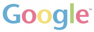
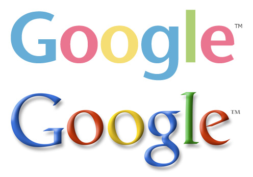
 You all may disagree. But I remain firm on the notion that Google needs a logo redesign. I use the site everyday as a homebase from which to navigate the internet, and quite frankly… The logo is stuck in November 2004. Yes, people are extremely sensitive to change, and perhaps the timing isn’t necessarily the best right now. But I still remain hopeful that Google is considering said design changes, or something similar.
As you can see from the comparison below. From a User Interface standpoint, Google’s current logo uses inner shadows, drop shadows and lighting angles that cast harsh radials and edges on the typeface. It’s not very pleasing.

You won’t find gradients in many Google products, and that’s a good thing. The gradient “wave” is coming to an end on the web, and for the most part, sleek, clean color pallets and light, fluid edges are at the core of usability… and likability as well.
Google may definitely see this is as too drastic of a change. But, they’re Google and they can tell people to like it. It’s clean, progressive and it’s still a few years ahead of where the competition will be.