It’s been a long time coming, but after seven months we’ve finally unveiled our new digs at Think Brilliant. We’ve pined over this design for a long time, and after bailing on two previous concepts this layout successfully emerged.
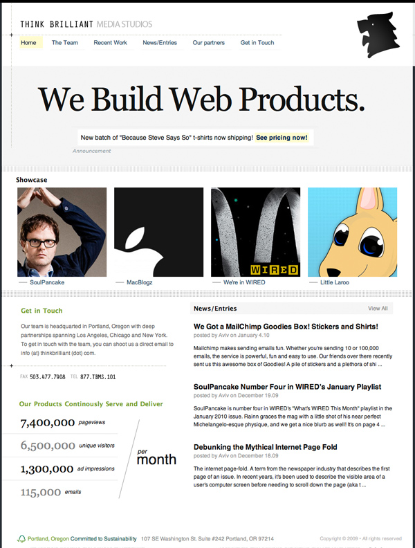
The Homepage: Lightweight, usable and clean. It gets straight to the point. No bullshit.

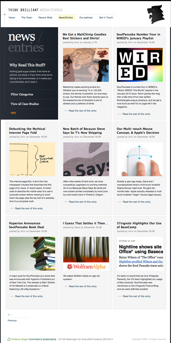
The news page (or “blog”) section of the app is a bit different. We went with a clean, focused grid view and nice tactile hovers for each entry. Thumbnails draw the user into viewing more content and provide a large clickable range to get drawn into a loop.

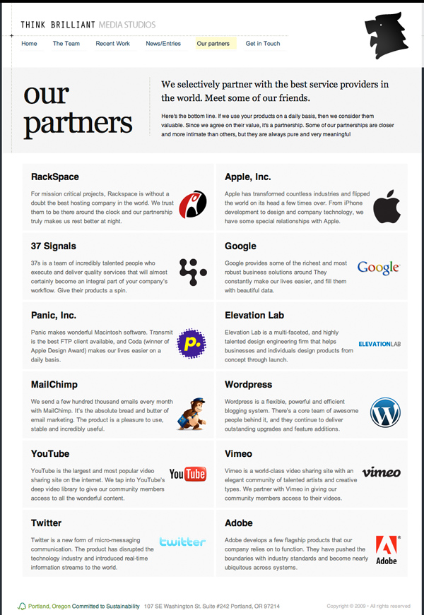
Partners Page: Showcasing our favorite companies, partners and why we work with them and use their products.

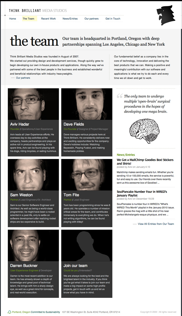
The team: Clean photos of everyone, some information about each person, and an open call for those that think they’re talented enough to join our team, to get in touch with us.
